
Background
While digital devices claim to connect us, all too often, they distract us from connecting with those directly in front of us, and staying touch with the physical world — leaving many feeling both ‘connected’ and socially isolated.
3 months after starting to use a smartphone, users experience a significant decrease in their mental arithmetic scores (indicating a reduction in their attentional capacity) and a significant increase in social conformity, as shown by experiments with 25-year-olds using randomized controlled trials. In addition, brain scans show that heavy users have significantly reduced neural activity in their right prefrontal cortex, a condition also seen in ADHD, and linked with serious behavioral abnormalities such as impulsivity and poor attention. [Source] This, among many additional harms to our current and future society, is why I would like to focus my efforts on a mobile-first website inspiring people to get off their devices.
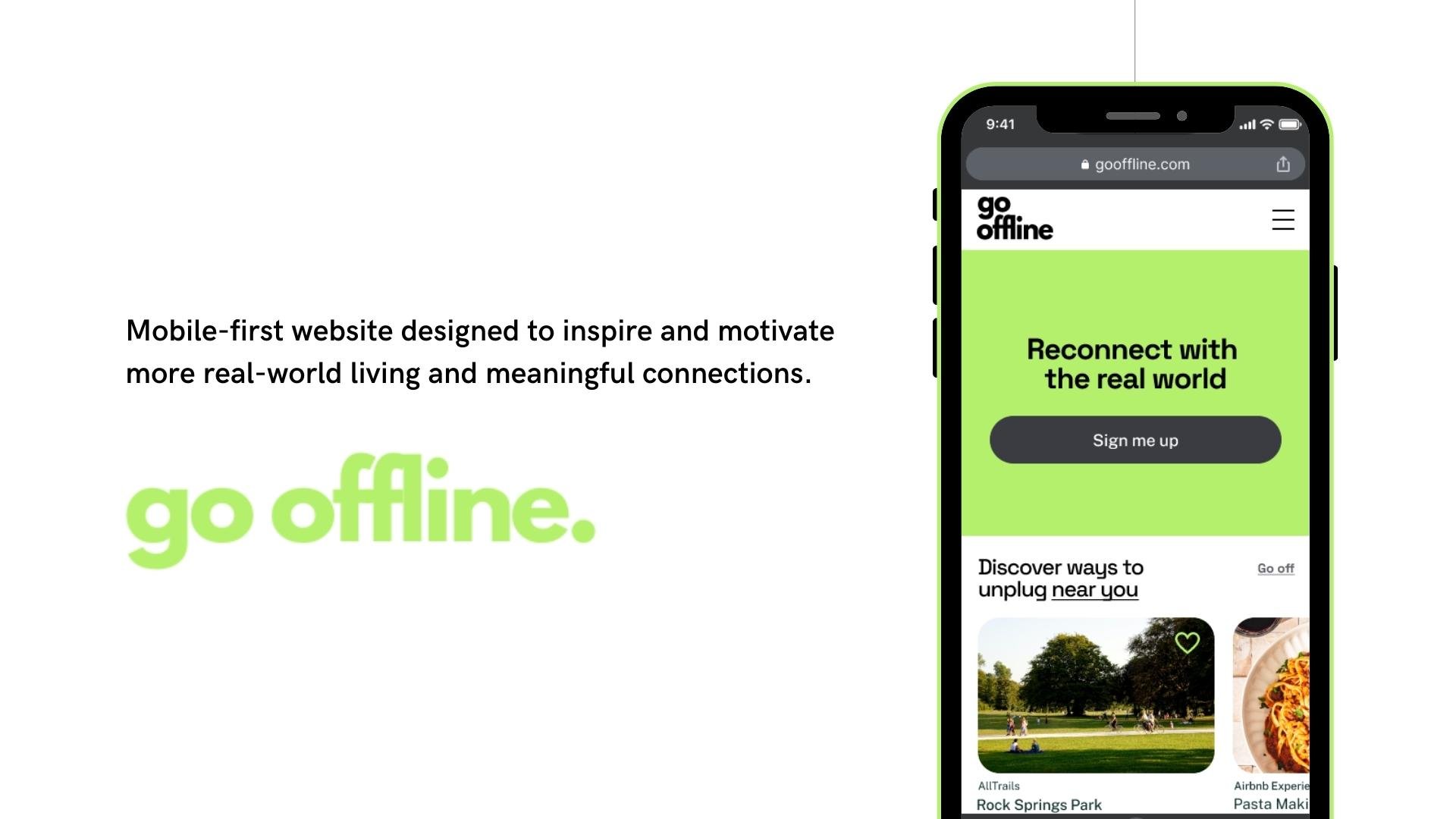
Go Offline is a mobile-first website designed to inspire and motivate more real-world living and meaningful connections. By integrating with services like AllTrails, Airbnb Experiences, ClassPass, and local event sites, I implore users to spend less time on screens and more time IRL (in real life).

Research
The goal of my research was to find out if a website containing ways to decrease screen time can help motivate users so that I understand what sort of content can persuade people to connect more in real life.
Objectives
Determine what goal creating this mobile-first website experience accomplishes
Understand how decreasing phone usage can increase one’s quality of life
Understand the process of quitting phone addiction
Learn what are the triggers and the ways to overcome them
Identify ways to inspire and motivate users to get off their phones
Methods
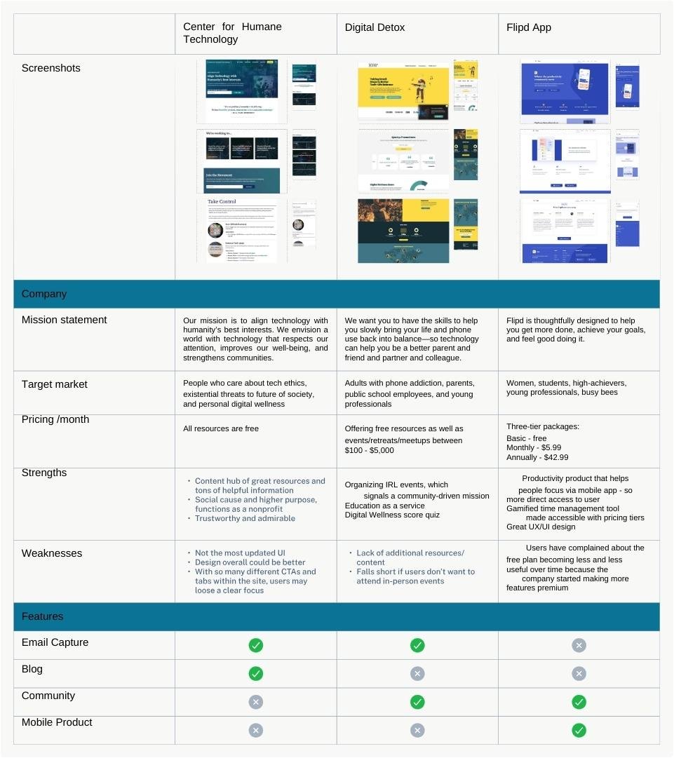
Competitive research to gather information on how other websites and apps have approached this problem
Developed an 18-question survey using Google Forms aimed to better understand a diverse range of users' thoughts, behaviors, and perceptions around phone addiction. A total of 20 responses were captured. This assisted in providing some quantitative data.
Conducted interviews with 5 survey respondents. Each interview lasted about 30 minutes on average. During the interview, we got to dig deeper, ask follow-up questions, and gather qualitative data.
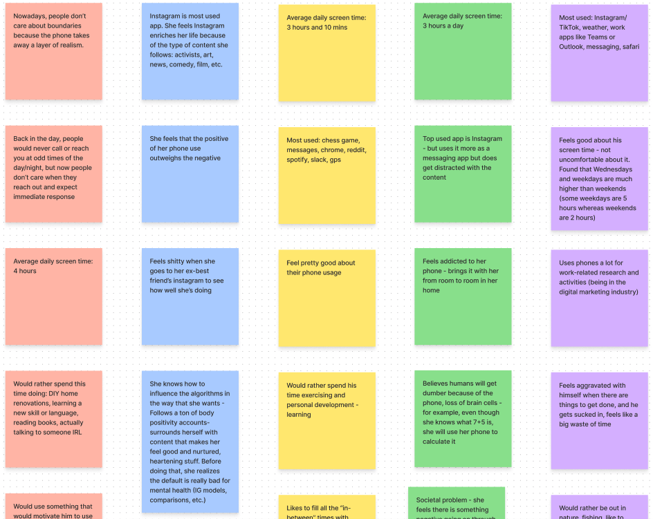
From the interviews
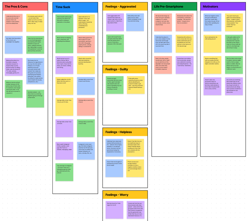
After conducting the interviews, I pulled quotes onto an affinity map and color-coded the sticky notes by each interviewee. Once that was done, I could easily visualize patterns and recurring themes.
The five recurring themes or category 'buckets' gleaned from the interviews:
The Pros & Cons of Smartphones
Time Suck From Phone Use
Feelings [subcategorized]
Aggravated
Guilty
Helpless
Worry
Contemplating Life Pre-Smartphone
Motivators to Use Phone Less
From the survey
85% feel there is a somewhat negative impact on their lives due to their phone usage.
Although 60% don't believe they are addicted to their phones, 95% feel that the world would be a better place if people used their phones less.
85% feel motivated to make improvements to the relationship they have with their phones.
When asked who they wished would improve their tech-life balance, we can see various answers ranging from romantic partners, children, parents, friends, colleagues, and the community in general. The ones that have the highest percentages include partners, friends, and overall community.
User Personas
Using the research, the next step in my process was to create user personas based on the real people I interviewed and surveyed. To help establish a clear purpose, I was able to identify the unique personas above.

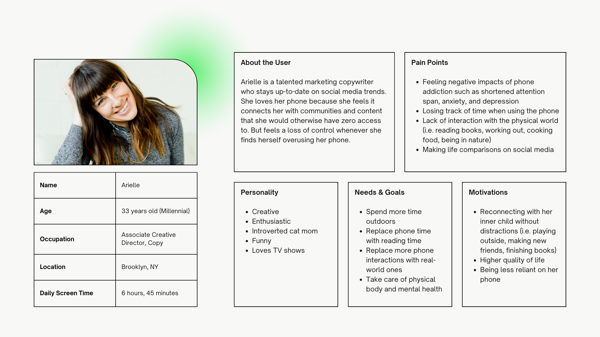
“I’d like to explore ways to help people who feel helpless about their phone addiction discover new and interesting ways to spark more real-life connections. ”
“How might we motivate and inspire individuals with phone addiction to spend more time in the physical world?”
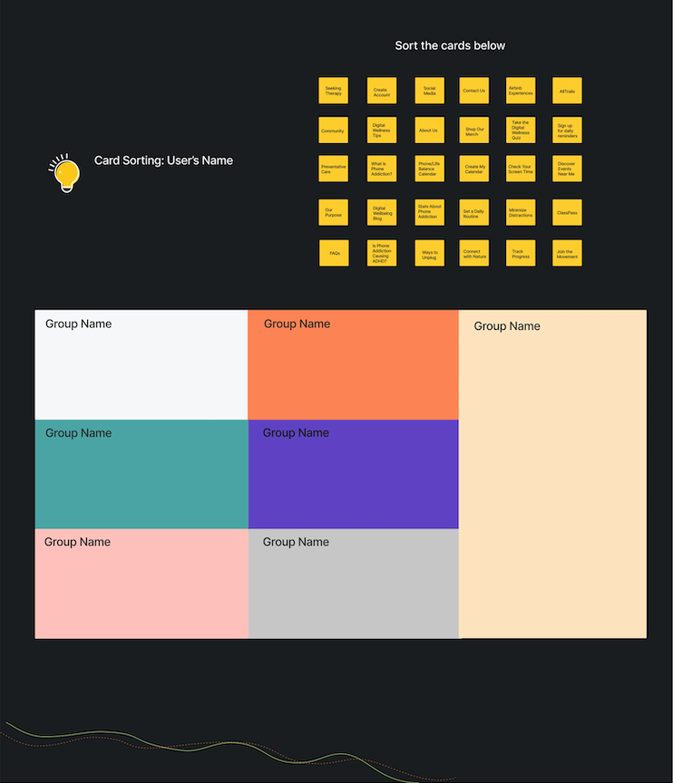
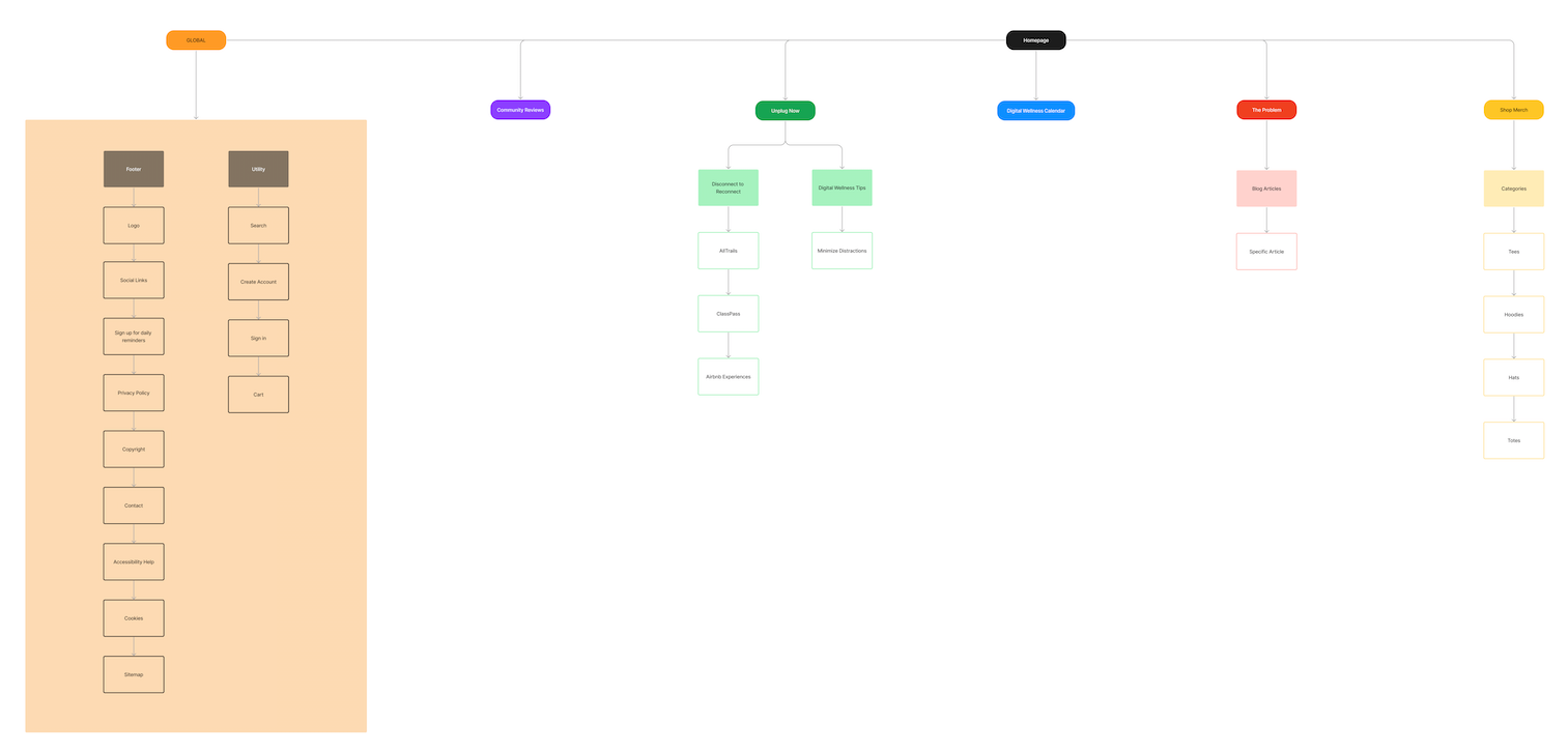
Card Sorting & Information Architecture
Performed a card sort with five target users and applied the insights gleaned to inform the sitemap.
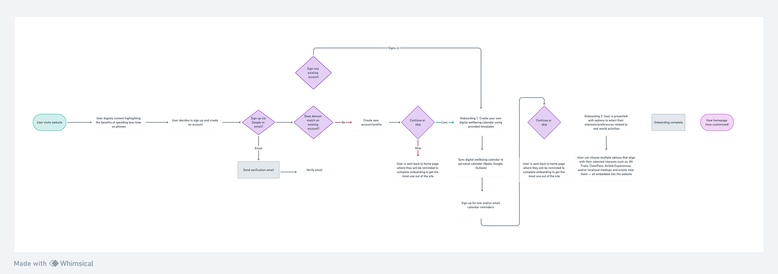
User Flows
Next, I created user flows using Whimsical. This involves mapping out the journey a user takes within the website, which helps me understand the user's experience, identify potential pain points, and optimize the interface for a seamless and intuitive interaction.
Low-to-Mid Fidelity Wireframes
Starting with low-fidelity wireframes involves creating basic, skeletal representations of the interface's layout and structure, typically using simple shapes and placeholders. Mid-fidelity wireframes add more detail and content, providing a clearer picture of the design without finalizing visual elements as seen below.


Brand & UI Library
Creating a brand style and UI library involves defining key visual elements that represent the brand consistently across digital interfaces. I started with brand guidelines, specifying a color palette, typography, and logo variations that connected with the target audience of Gen Z and Millenials. For UI, I established a consistent design system with reusable components such as buttons, iconography, cards, forms, navigation, and more.

High Fidelity Prototype
Finally, it was time to begin bringing this idea to life! High-fidelity wireframes add polish and detail, incorporating actual design elements, colors, and visuals to closely resemble the final product. After that was all set and done, I created a prototype in Figma, designing interactive, linked frames to simulate user flow. I designed interactions like taps or swipes to connect the frames together.
Usability Testing
And now for the main event: testing my prototype with users in real time! I used Usability Hub for user testing and feedback. This progressive approach allows me to iterate and refine the design at each stage before committing to the full visual and functional implementation.
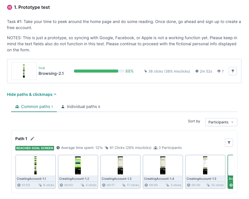
Task 1: Creating an Account
Success: 75% of users found the task very easy, with the majority perceiving the sign-up process positively.
Challenges: Some confusion regarding CTA terminology and minor design issues on mobile.
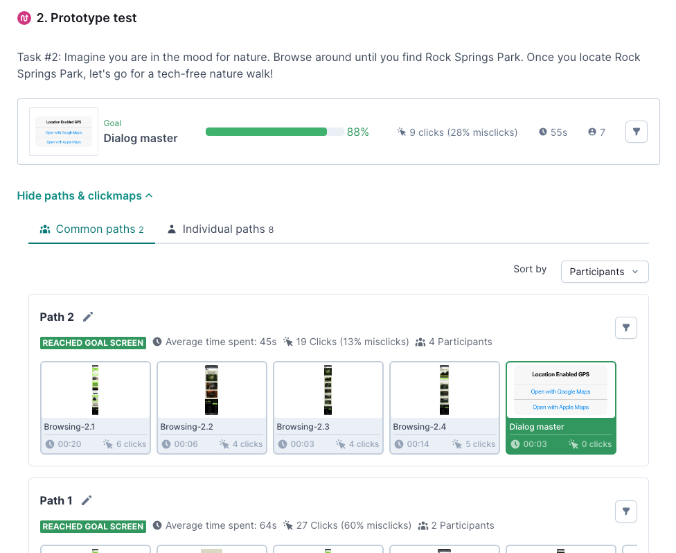
Task 2: Finding Rock Springs Park
Success: 88% of users found the task easy, demonstrating the site's effectiveness in helping users navigate and find local events.
Challenges: Users expressed confusion about the "Happening IRL Near You" feature and suggested improvements to the visibility of the "View All" button and hamburger menu.
Overall User Perception:
The site's design and experience were generally perceived positively, with users appreciating its modern aesthetic, user-friendliness, and ease of use.
Key areas for improvement include refining CTA language, optimizing mobile design elements, and enhancing the clarity of certain features.
Takeaways
Transitioning from research, user flows, information architecture, sketches, and wireframes to user-testing and high-fidelity prototypes in Figma involved a series of several steps to refine and enhance the visual and interactive aspects of my mobile-first website design. Every single one of these steps are essential in my user experience design process, helping to understand the user's experience, identify potential pain points, and optimize the interface for a seamless and intuitive solution.